When working on a client’s Kadence site—I noticed an issue: on mobile devices, there was a huge amount of white space below the hero slider. It looked perfect on desktop, but on smaller screens, it was a problem. If you’ve run into this too, here’s how to track down the cause and fix it.
The culprit? A minimum height setting applied to the container holding the slider. Let’s walk through how to resolve it step-by-step.
Step 1: Identify the Source of the Space
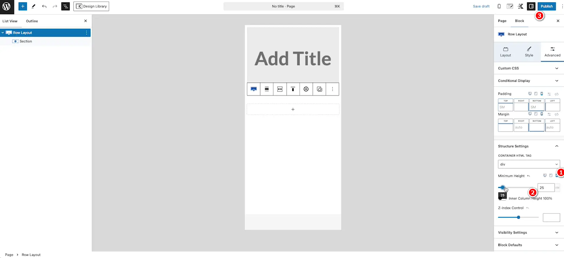
First, inspect the hero section. In my case, the slider was nested inside a Row Layout or Section block (I was using Kadence Blocks, but this applies to similar setups). On desktop, I had set a minimum height to make the slider fill the viewport, which worked great. But on mobile, that same height created a massive gap below the slider.
To confirm this is your issue, check the block settings for the container (Row Layout, Section, or similar) that holds your hero content. Look for a “Min Height” field—chances are, it’s set to a large value like 100vh or a specific pixel amount.

Step 2: Adjust the Minimum Height for Mobile
The fix is simple: tweak the minimum height for tablet and mobile views separately. Most modern block editors, like Kadence, let you set responsive values for different screen sizes. Here’s how to do it:
- Open your page in the WordPress editor.
- Select the Row Layout or Section block containing your slider.
- In the block settings (usually on the right sidebar), find the “Min Height” option.
- Look for the responsive controls—small icons for desktop, tablet, and mobile.
- Keep the desktop height as is (e.g., 100vh or 600px—whatever suits your design).
- Switch to the tablet and mobile tabs, and set a smaller value, like 50vh or 300px, or even remove the minimum height entirely for those views.
This ensures the hero looks full-screen on desktop but doesn’t leave awkward space on smaller devices.
Step 3: Test and Fine-Tune
After adjusting the settings, preview the page on your mobile device or use the editor’s responsive preview. Scroll to ensure the white space is gone and the content below the hero flows naturally. If it’s still off, play with the mobile height value until it feels right.
Why This Happens
The minimum height setting is a powerful tool for desktop layouts, especially for hero sections. But without responsive adjustments, it can wreak havoc on mobile views. By customizing it per device, you get the best of both worlds.
Now, your site will look polished across all devices. Problem solved!

